Featured Work
01 / 20
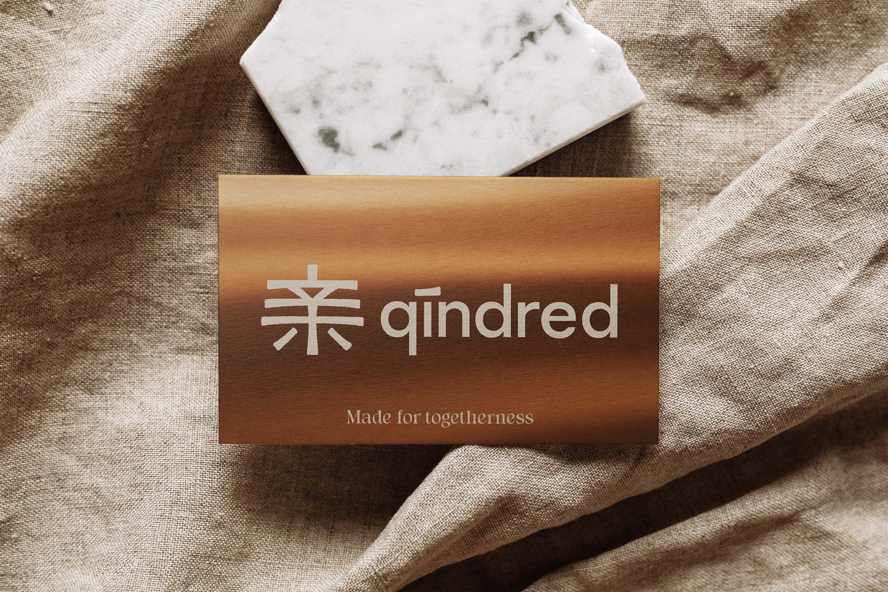
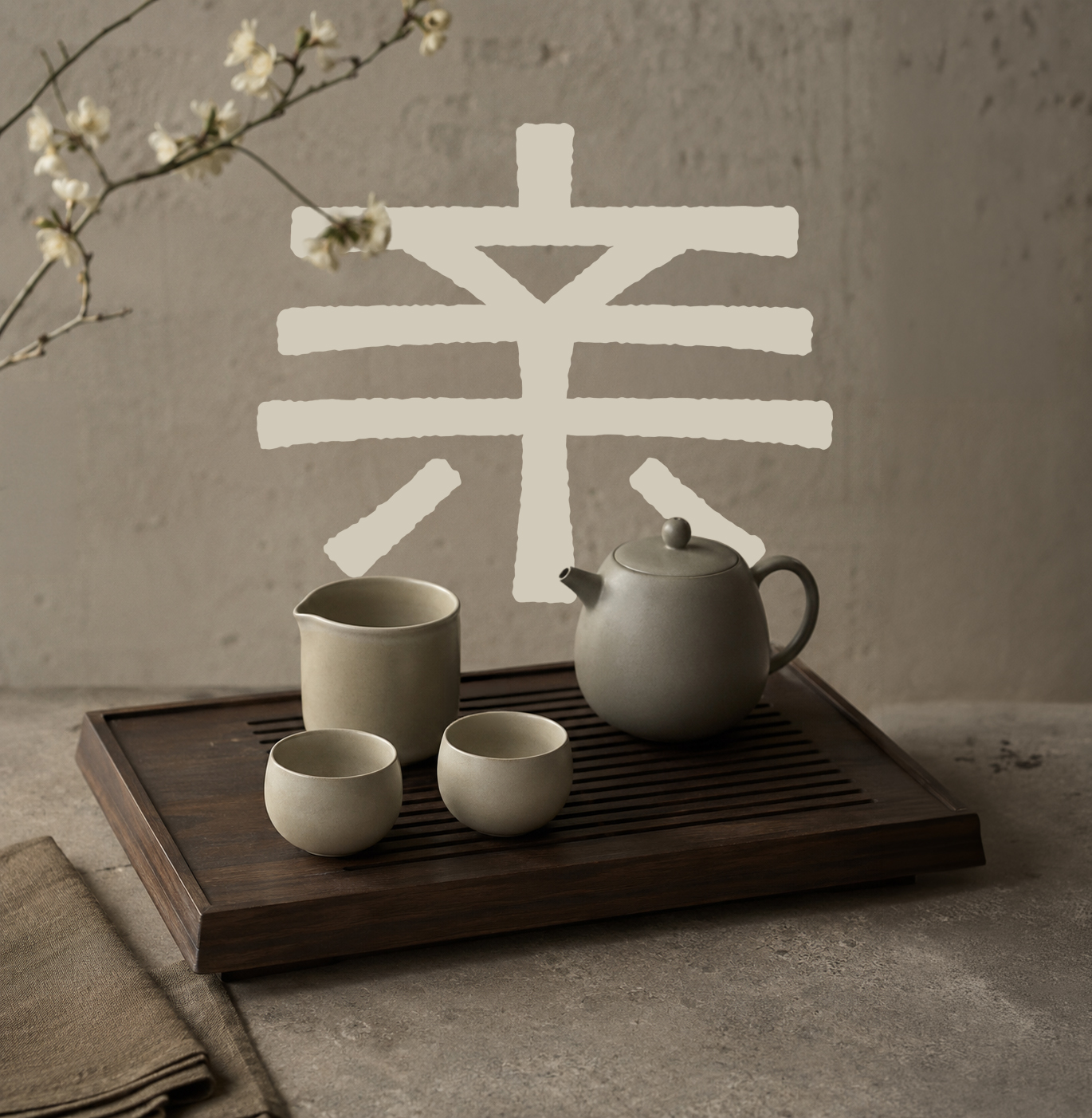
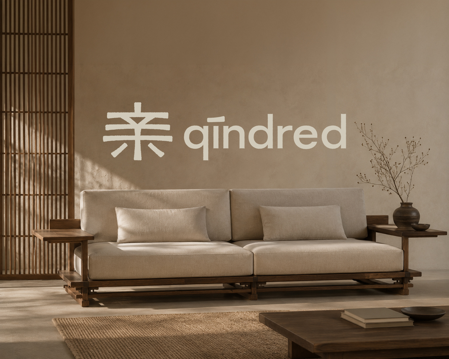
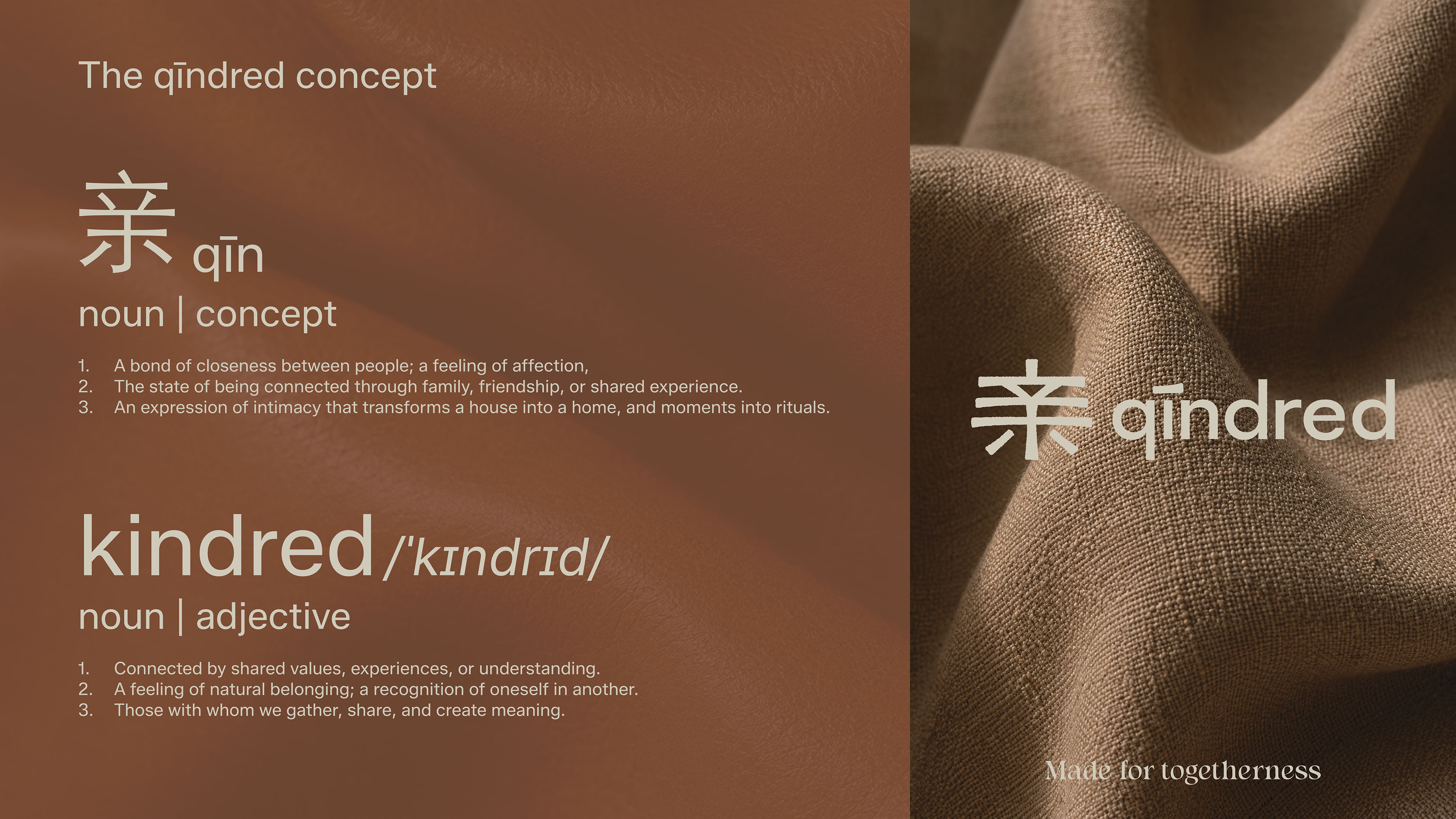
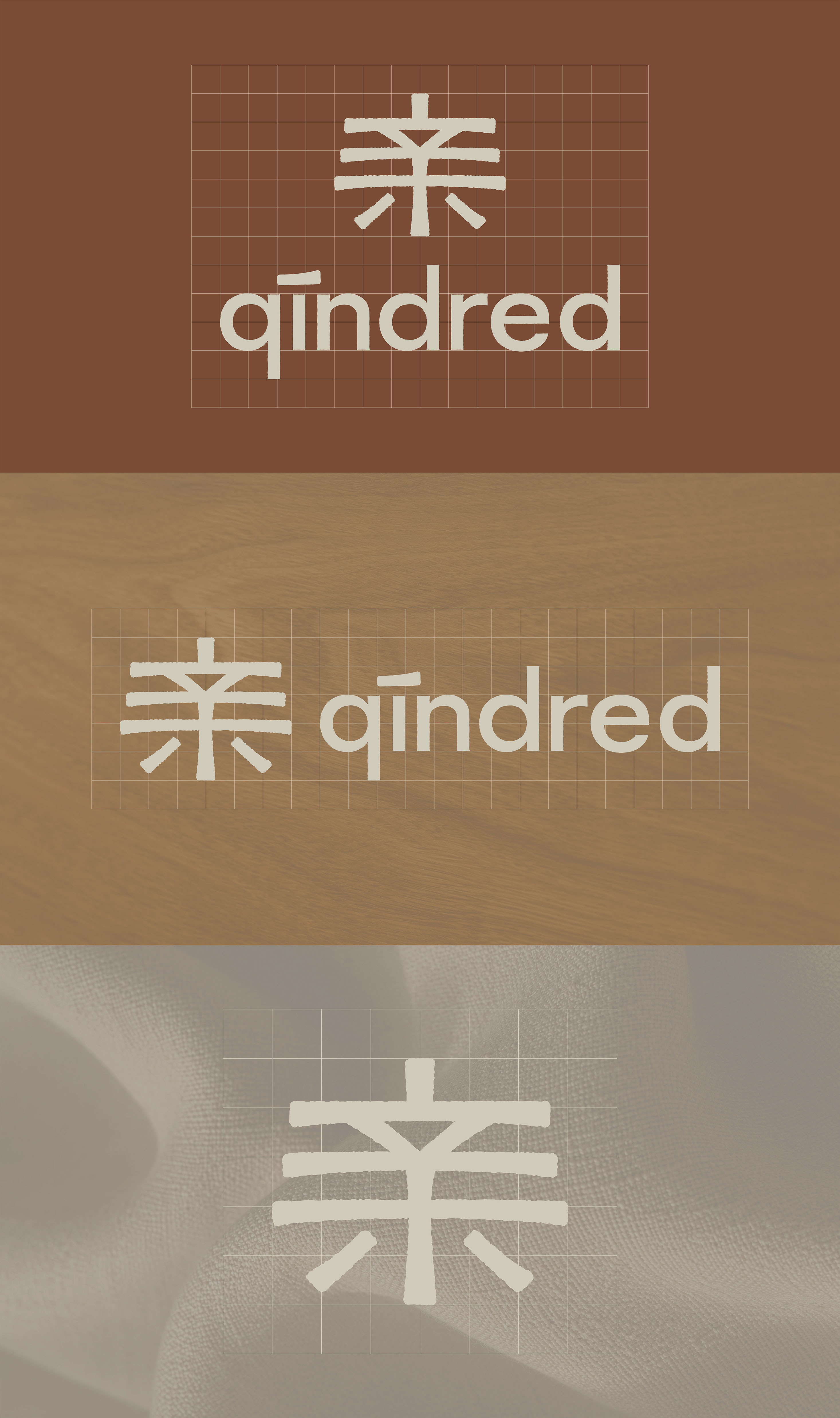
qīndred
Logo and brand identity concept rooted in the idea of kinship across cultures.
About
qīndred is a personal branding concept built around a single idea: objects that bring people together. The name fuses the English word "kindred" with the Chinese character "亲" (qīn), both meaning family and closeness. That duality shapes everything, a brand rooted in Chinese heritage but designed for modern living, where a bowl passed across the table or a pot of tea shared among friends carries as much weight as the object itself.
Overview
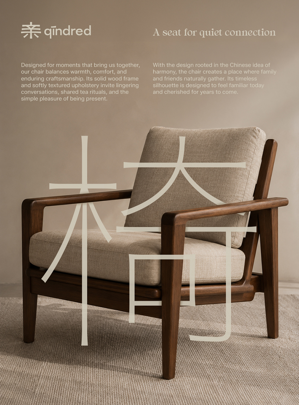
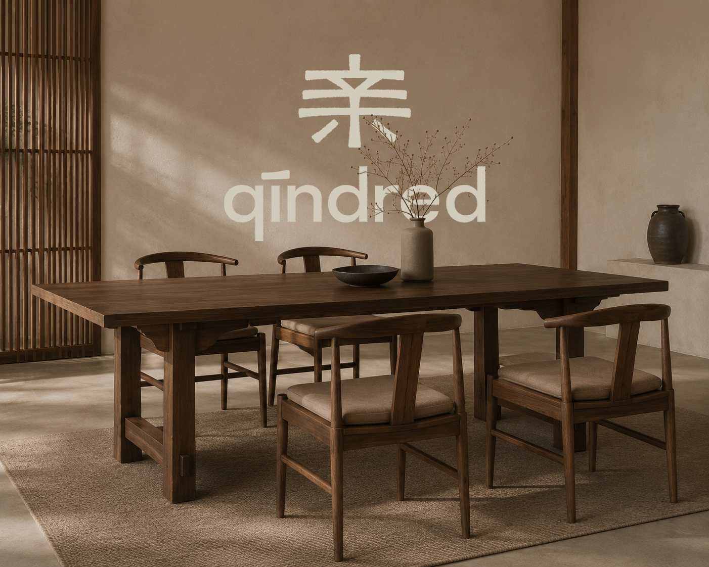
This was a self-initiated project, a personal challenge to build a brand with enough depth to hold up across a full product world. The scope spans dining, tea and ritual, bath and linen, home objects, and furniture, each category designed around moments of connection rather than individual use.
The brand sits in premium territory, clean, timeless, and considered. The colour palette of warm taupes, terracottas, and soft neutrals gives qīndred a quiet confidence, nothing loud, nothing decorative for its own sake. The visual language draws on Chinese heritage without leaning into tradition, contemporary enough for modern homes, meaningful enough to feel like it belongs there.
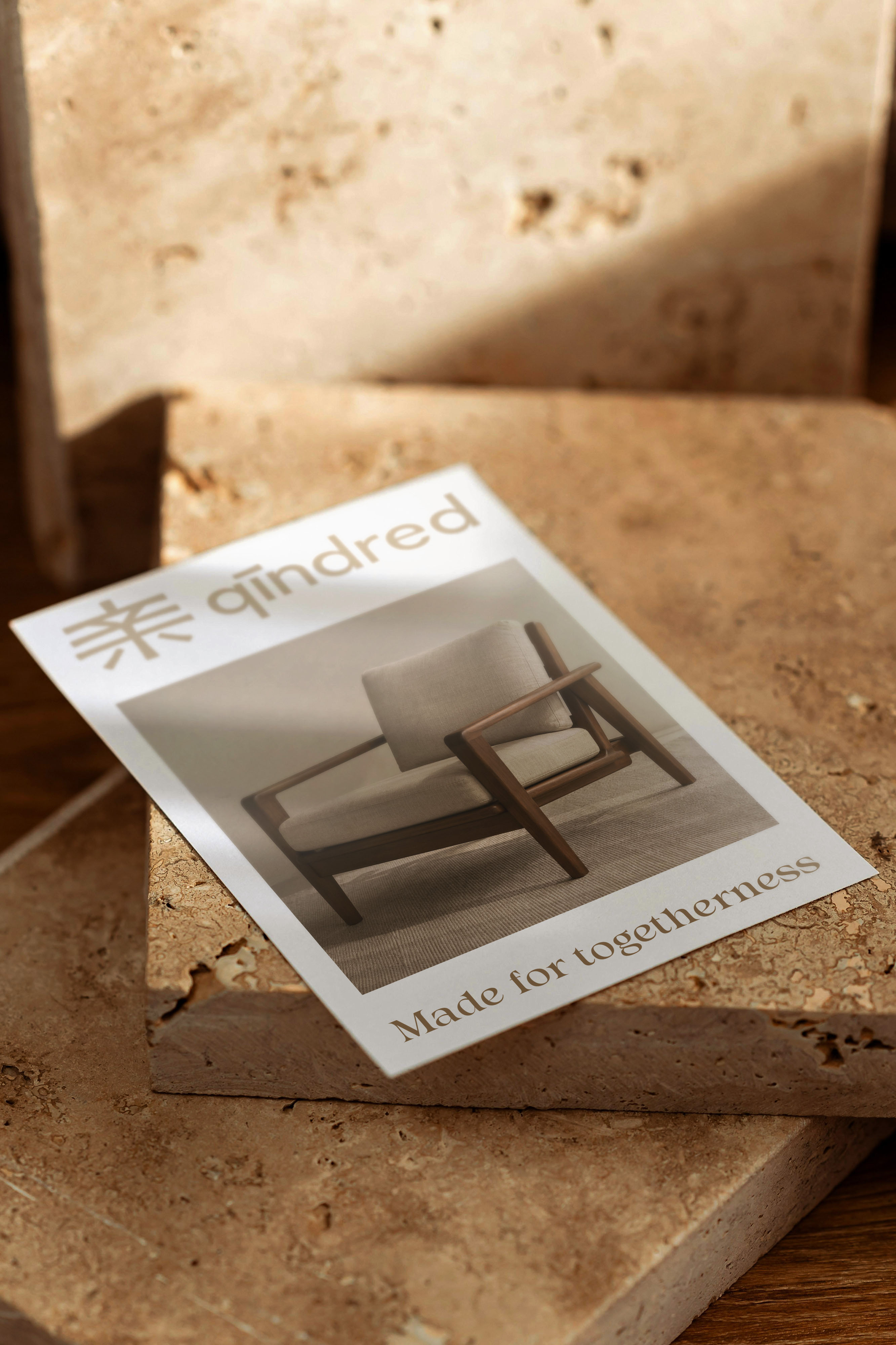
Every object in the range exists to serve the same purpose. Not minimalism for its own sake, but restraint in service of something warmer: gathering, hospitality, belonging. Made for togetherness.